STUDENT PROJECT • SPRING 2019
information architecture • wireframing • user testing • product roadmapping
Focus: wireframing & financial modeling
Map, design, test, and plan launch of a banking app with added financial modeling feature.
I worked as the sole designer, project manager, and product manager on this 16 week project. I worked with a developer to size and price the product.
INFORMATION ARCHITECTURE
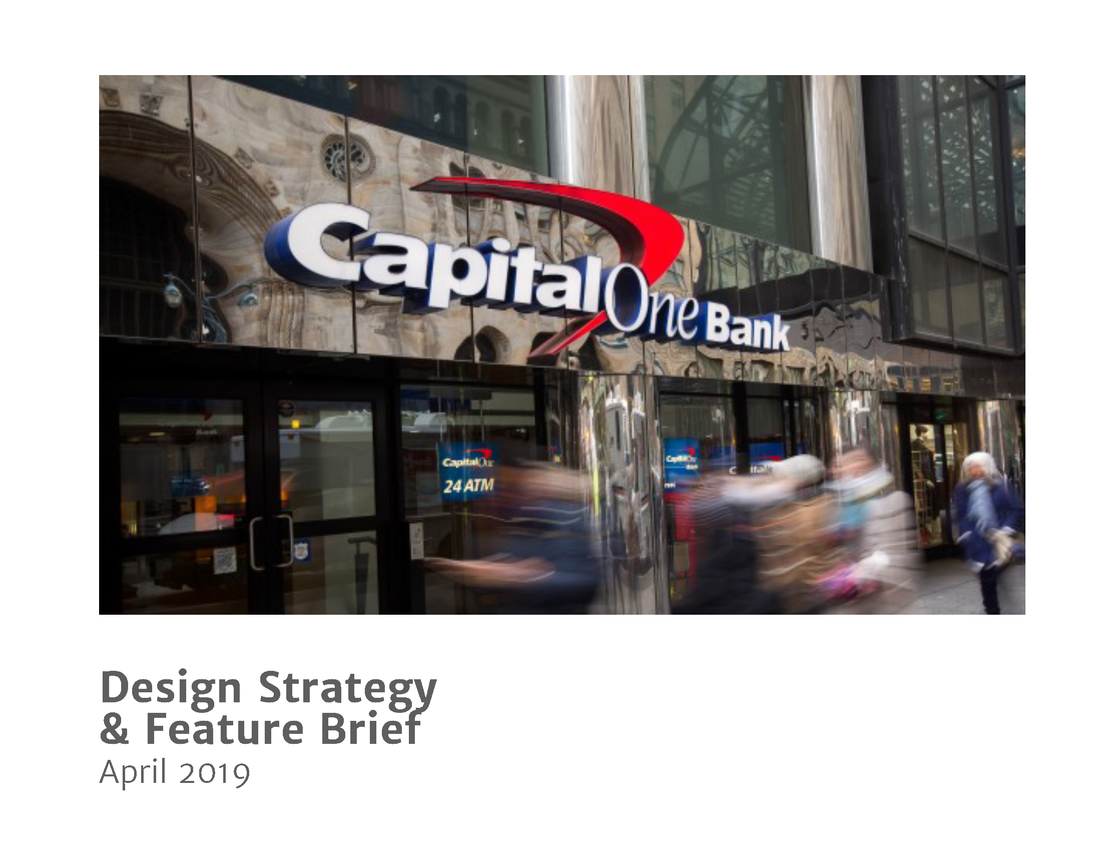
We were tasked to choose a banking app on which we’d base our entire quarter-long project and I chose Capital One. I chose it because–of all the banking apps I use–it was the most intuitive, clean and easy to use. I felt like if I had to dive into a banking app for 8 weeks it should at least be one I like looking at and using. This might have been the wrong tactic, in hindsight.
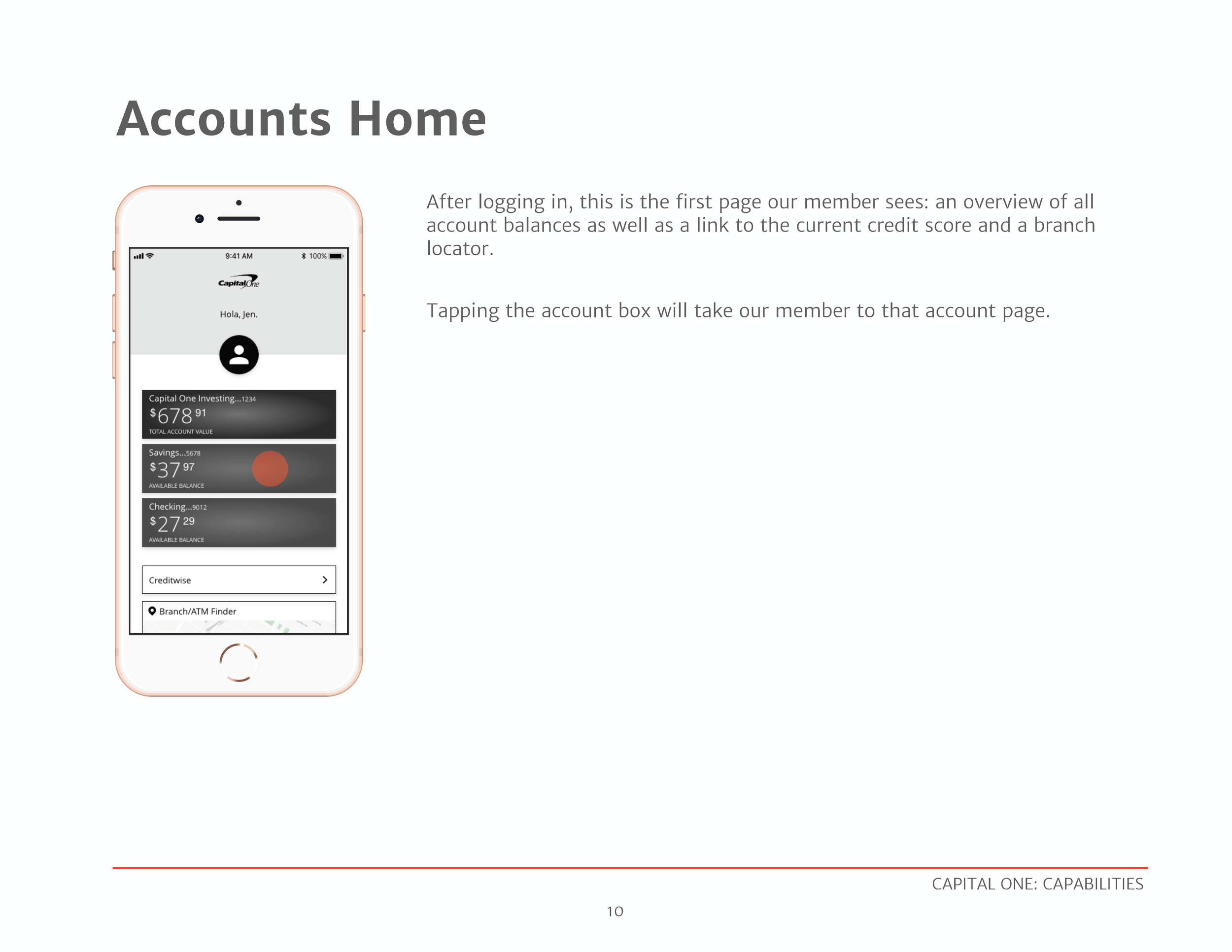
The first step was mapping out the entire app into a flow.


WIREFRAMING FLOWS
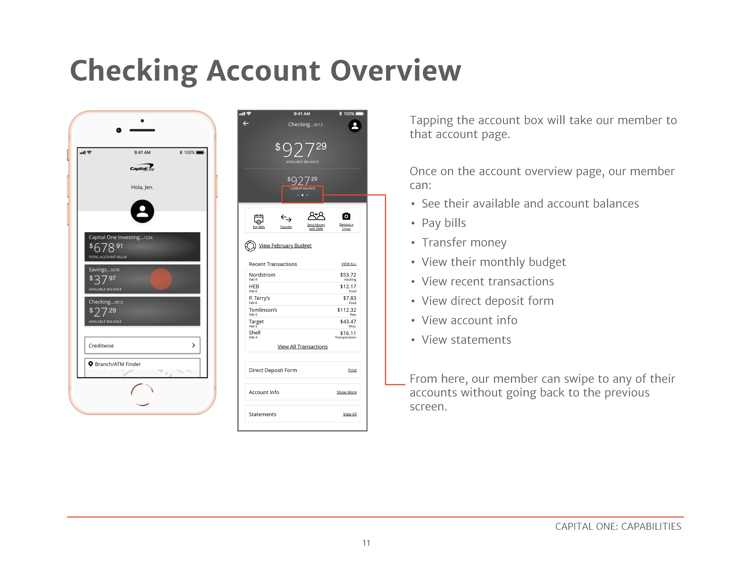
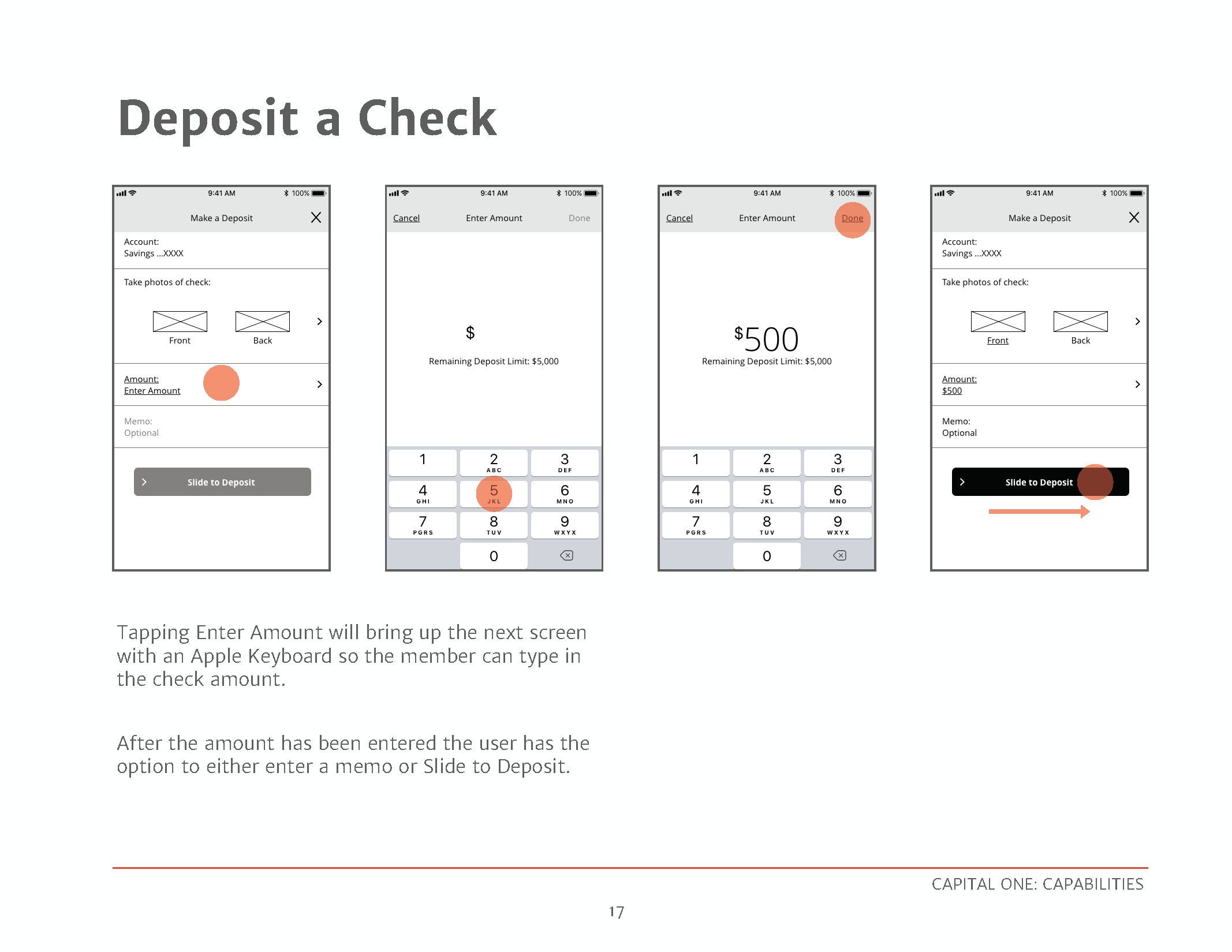
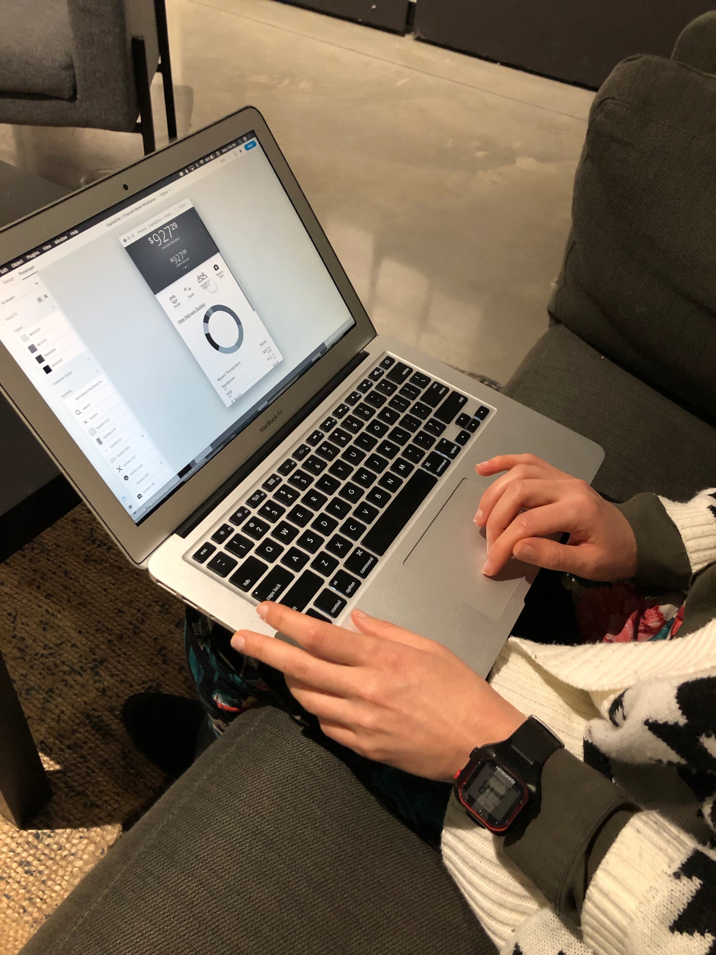
I then wireframed several flows. Part of the assignment was to make any improvements we felt like needed to be made. And here is where I realized that maybe using Capital One wasn’t my best decision. I didn’t have much I wanted to improve!
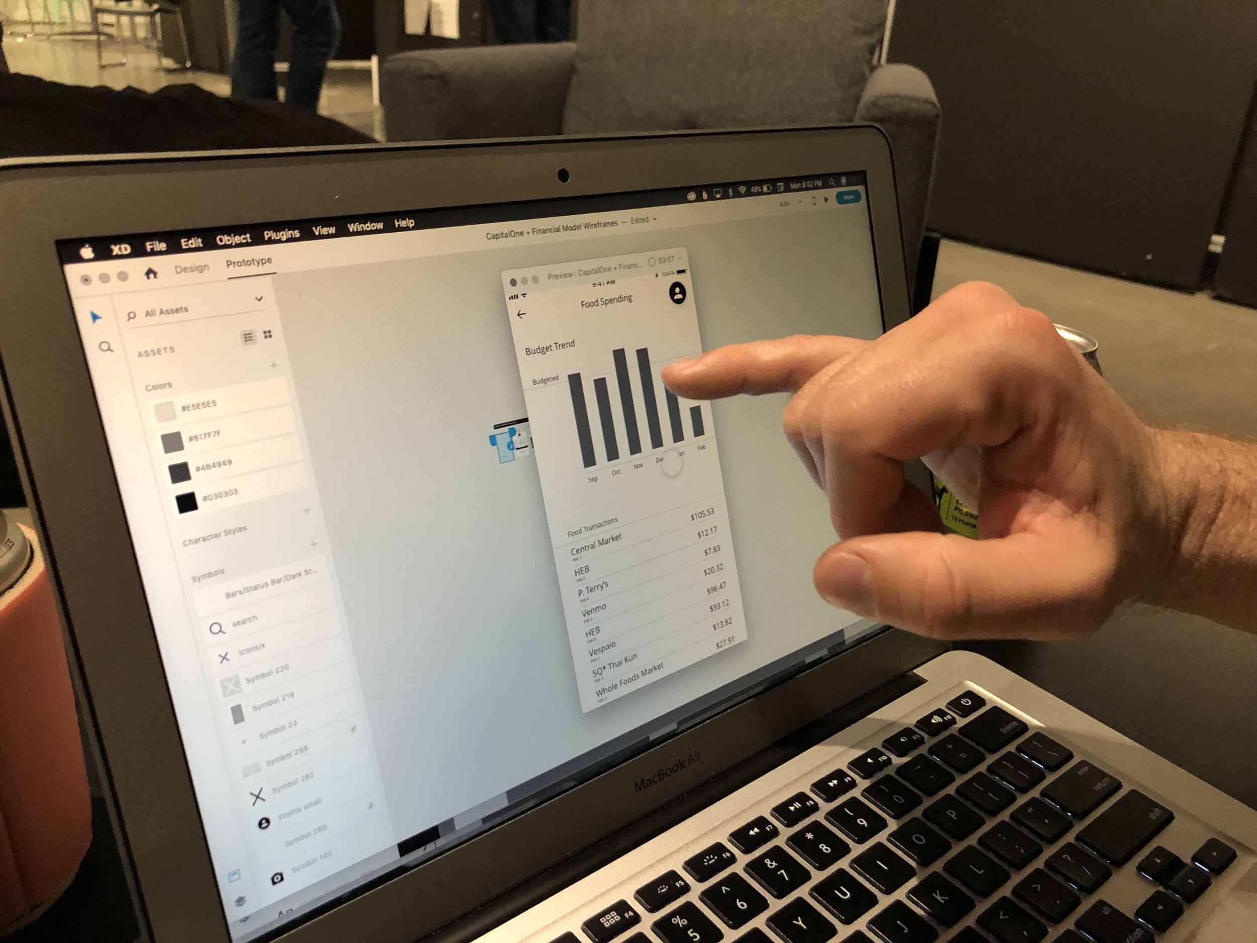
One thing I did add was making the Security Code accessible from the app. As a user of both Capital One and You Need a Budget I felt like I was constantly having to access this code to allow YNAB access to my accounts. But it’s currently accessible only from the website and I could never remember how to get there. So I added that flow to my app.


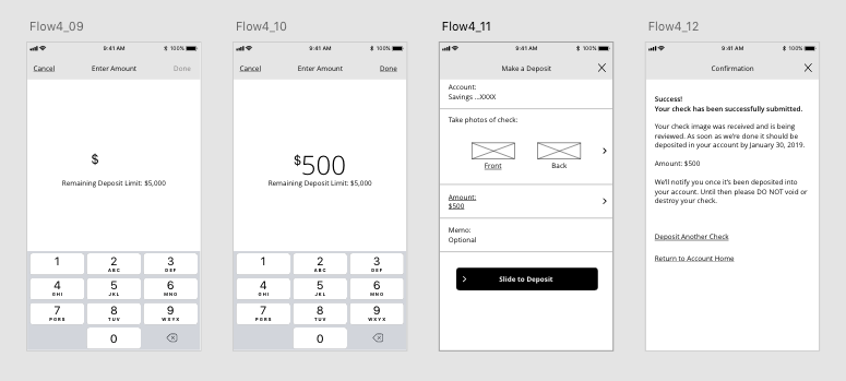
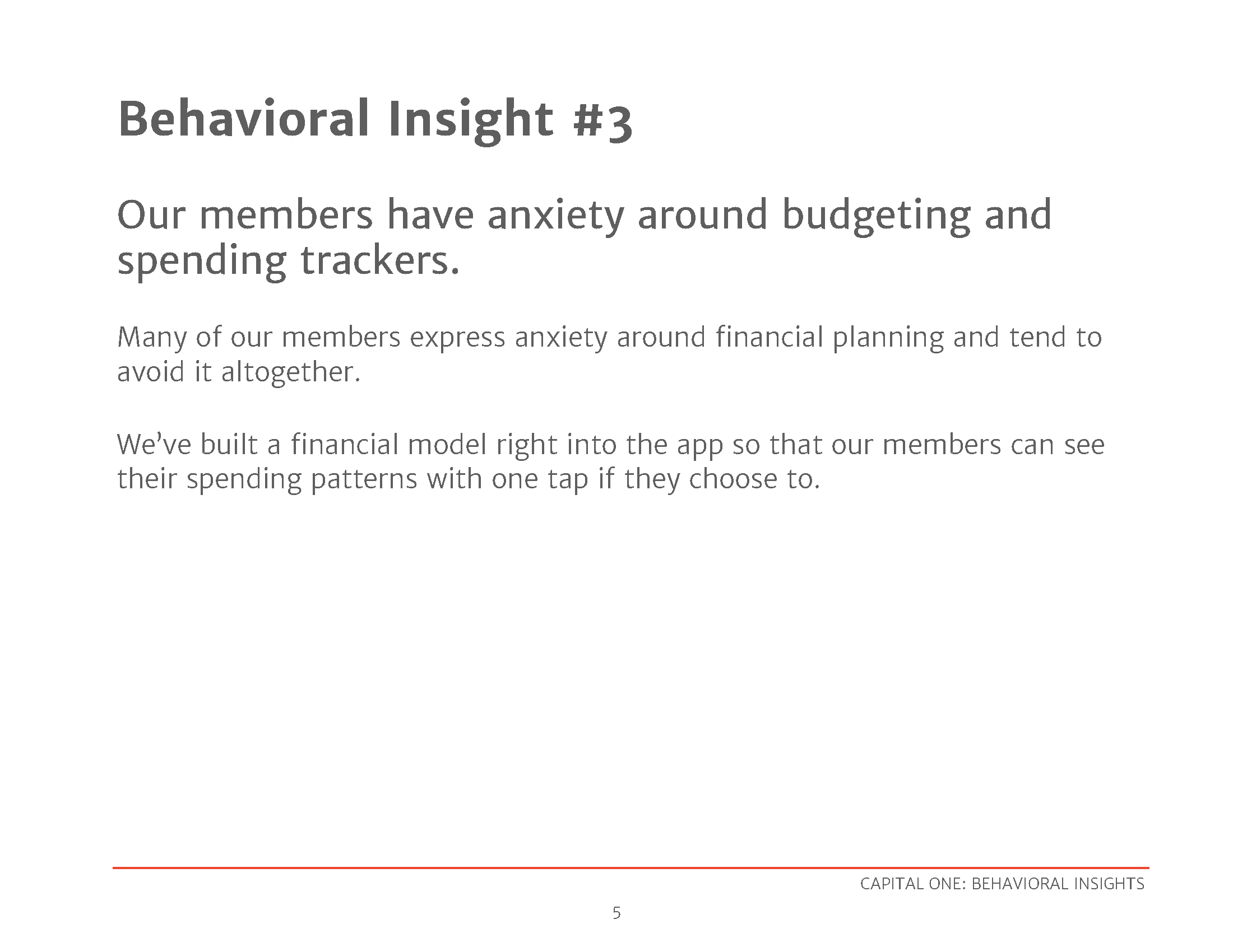
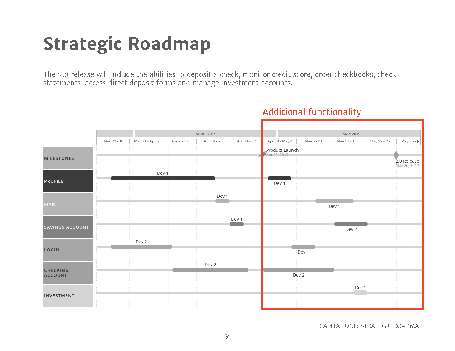
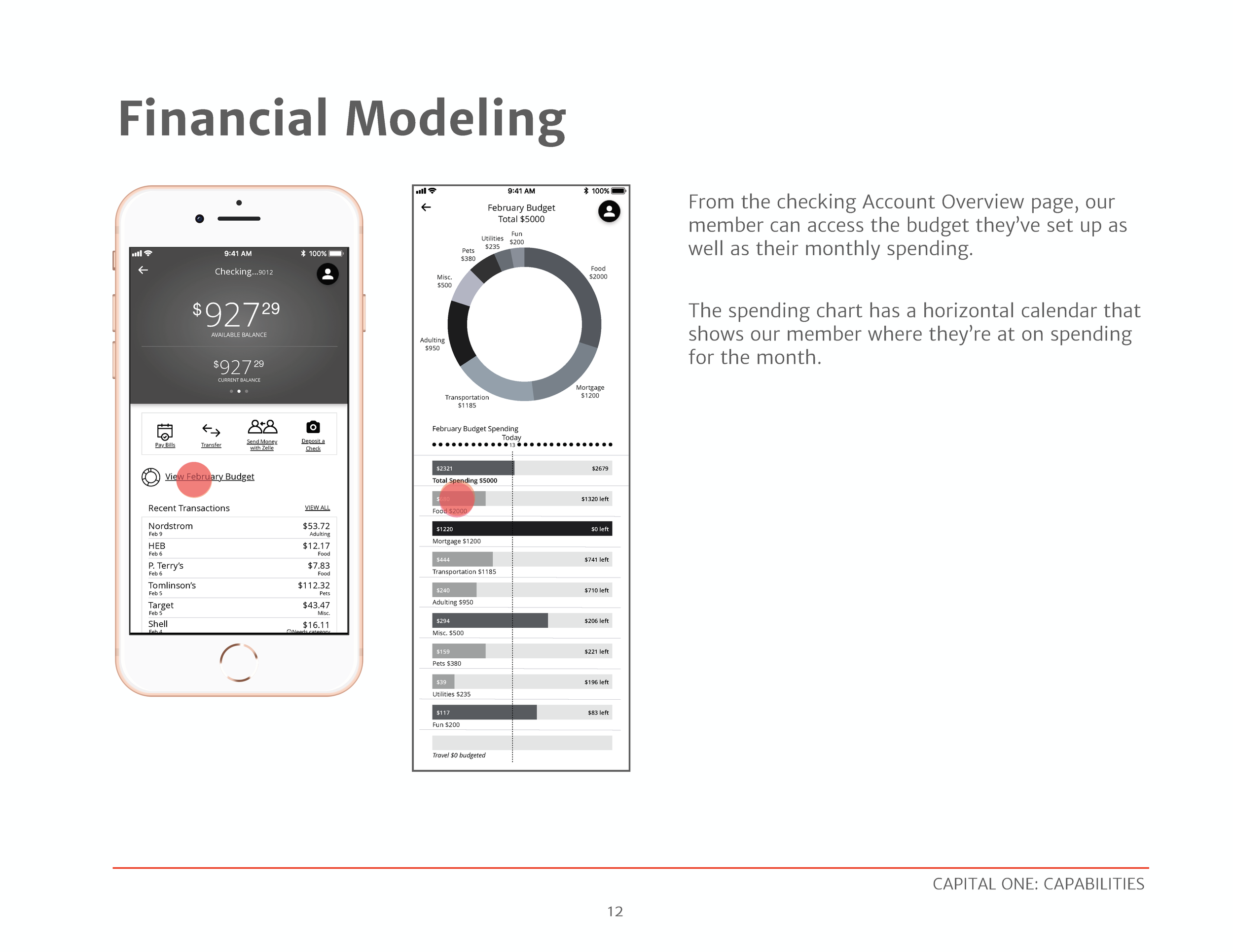
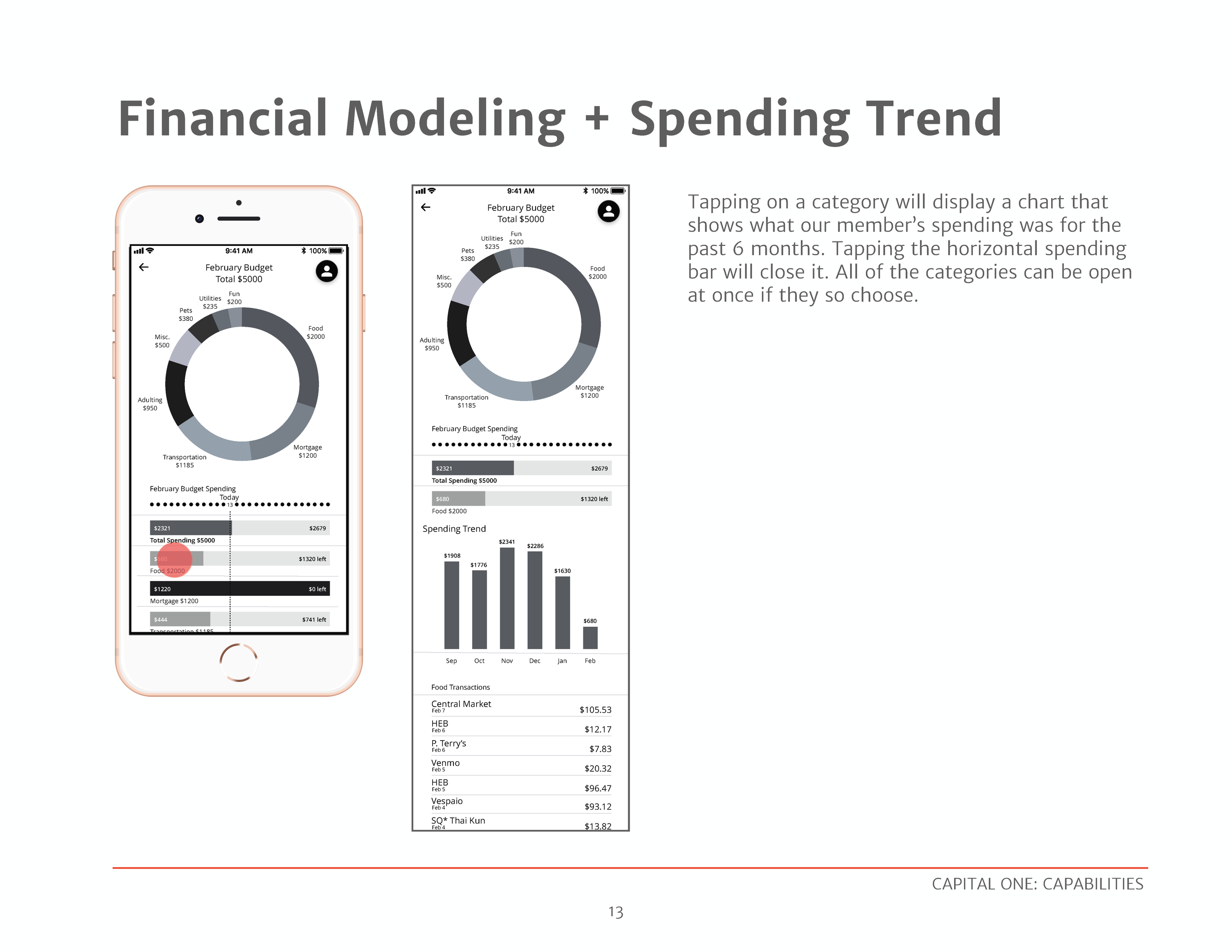
The next assignment was to add a completely new feature to the banking app: financial modeling, or budget tracking. I used Mint and You Need a Budget for inspiration, as well as adding some features that that I, as a sometimes-more-than-others budgeter, would like to see.


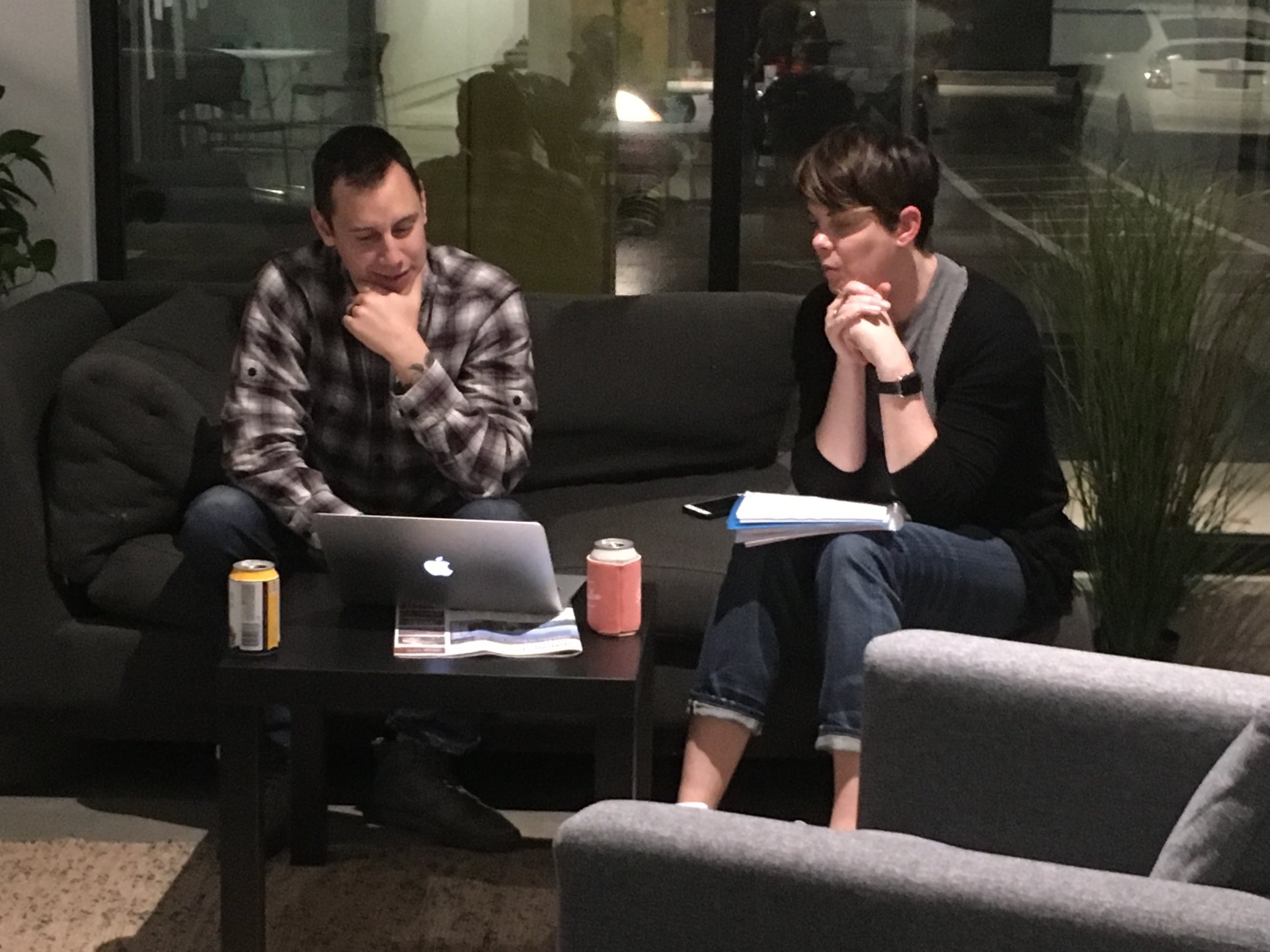
USER TESTING
Once our flows were complete, we had a user testing night and invited friends and family to come test our products. I had been nervous about this but, perhaps unsurprisingly, found the feedback helpful rather than scary.
DESIGN STRATEGY & FEATURE BRIEF